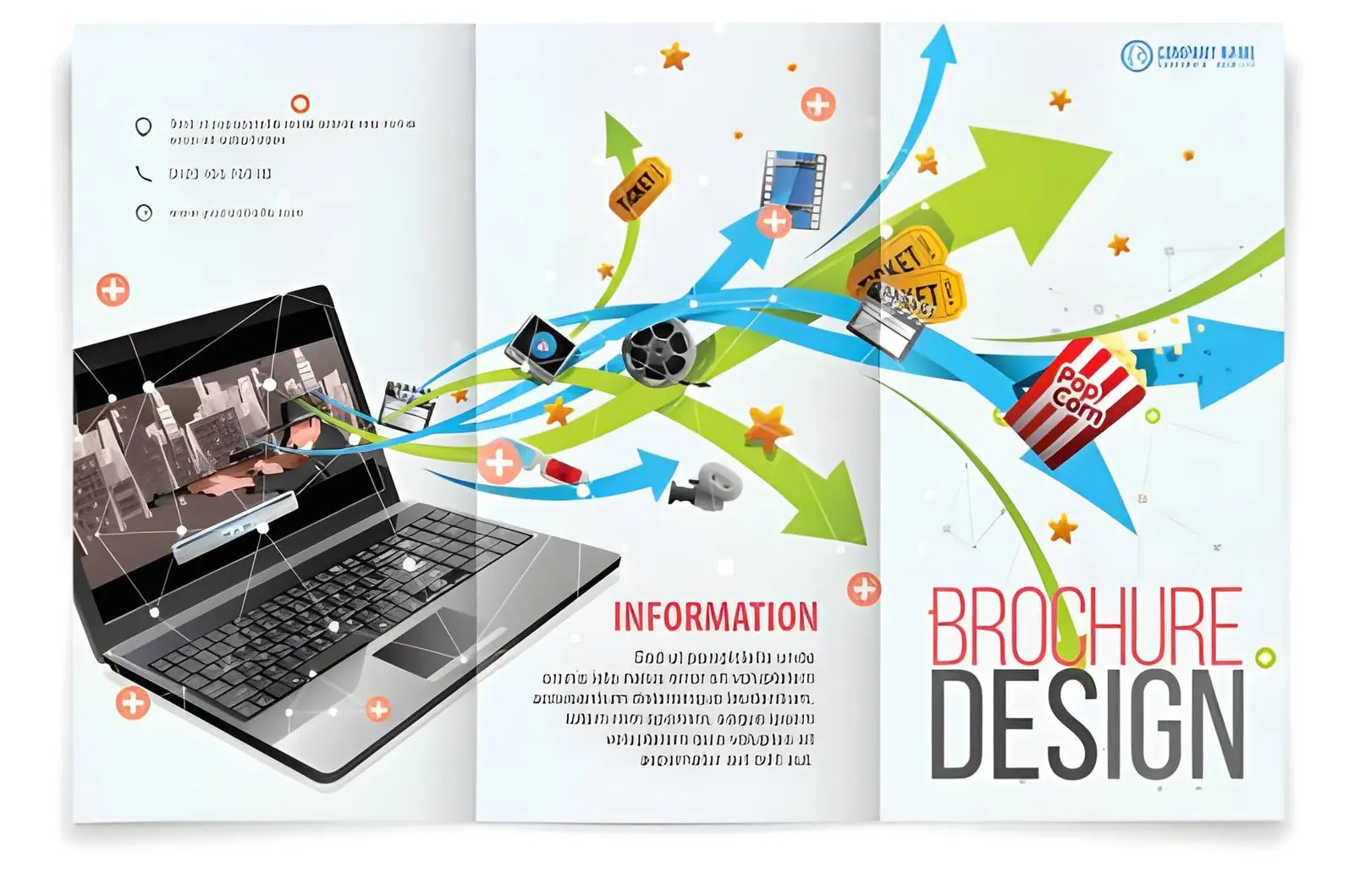
When you hand a prospect a business brochure, you are asking for their undivided attention in a noisy world. Many business owners treat the creation of this document as a two-part assembly line, hiring a designer to make it look pretty and a writer to fill the blanks. This disconnected approach usually creates a disjointed final product where the visuals pull the reader in one direction while the text plods along in another. To truly win over a smart audience, your design and your words need to work as a unified team from the very beginning.
Great marketing communication relies on immediate clarity rather than flashy gimmicks or technical jargon. The layout tells the reader where to look first, while the words explain exactly why they should care about being there. When these two disciplines align, the brochure ceases to be a simple information sheet and becomes a smooth, persuasive journey.
The Visual Greeting and the Written Handshake
Think of your brochure layout (or pitch deck in the movie world) as the storefront window and the written copy as the salesperson waiting inside. If the window is a chaotic mess, nobody walks through the door, but if the salesperson is silent or confusing, the initial interest evaporates. The design creates the emotional mood and establishes immediate credibility within a fraction of a second. Once that visual hook lands, the text steps in to do the heavy lifting of building trust and explaining your value.
Let us look at a common mistake that happens when these elements are treated as separate silos. A company wants to promote a premium service, so the designer uses elegant, minimalist layouts with vast open spaces to signal luxury. However, the copywriter provides massive blocks of dense text, forcing the designer to shrink the font to a microscopic size just to fit it all in. The sense of premium quality is instantly destroyed because the visual message of elegance contradicts the cluttered reality of the text.
Scenario: The High-End Eco-Builder
Imagine a boutique construction firm specializing in sustainable, premium home renovations. If they print a brochure with stark, industrial layouts and heavy dark borders, the visual message feels cold and clinical. Even if the text beautifully describes warm, energy-efficient family spaces, the reader experiences a subconscious disconnect.
By working together, the designer introduces earthy textures and open layouts that mimic natural light, while the writer uses warm, grounded language to describe the living experience. The text sits comfortably inside the layout, using short paragraphs that give the imagery room to breathe, reinforcing the eco-friendly luxury message.
Guiding the Reader’s Eye and Mind
A successful brochure design follows a natural narrative arc that respects how people read physical media. The front cover is not the place for your entire company history; its sole job is to intrigue the reader enough to make them open it. Inside, the design should establish a clear visual hierarchy using varied font sizes and thoughtful spacing to signal which points matter most. The copywriter supports this structure by keeping sections focused, ensuring that a quick skim reveals the core benefit of your offering.
When headers are too long or poorly placed, they disrupt the natural flow of the page and confuse the eye. Designers need to know the length and tone of the headlines early on so they can frame them as major visual landmarks. Simultaneously, the writer must understand the layout constraints so they do not pen a brilliant line that gets awkwardly split across a page fold.
Scenario: The Software Integration Firm
Consider a business consultancy that helps clients stream line their messy corporate data systems. If the brochure features abstract geometric shapes alongside paragraphs filled with developer jargon, a busy executive will likely toss it into the recycling bin. The concept is simply too abstract to absorb during a hectic workday.
To fix this, the team collaborates to create a visual and textual metaphor of a bridge or an open pathway. The designer uses clean lines to connect separate boxes on the page, representing the unification of disconnected software tools. The writer places clear, benefit-driven subheadings directly above these visual bridges, using everyday language to explain how saving time on admin helps the client grow their profits.
Balancing Information with Breathing Room
It is tempting to cram every single feature, award, and testimonial into a single printed piece to get your money’s worth. However, a crowded page actually repels readers because it feels like hard work to decipher. White space, which is the empty area around text and images, is a deliberate design choice that gives the brain time to process what it just read.
To achieve this balance, your written content must be concise and purposeful from the very first draft. Instead of writing long-winded paragraphs, use a targeted layout where the text answers the specific questions a skeptical buyer is already asking.
A well-coordinated brochure generally focuses on these core structural elements to maintain clarity:
- A front cover that highlights a single, primary problem your customer faces.
- Internal sections that pair one clear operational benefit with a supporting photograph or diagram.
- A distinct, uncrowded back page dedicated entirely to the next step you want the reader to take.
When you respect this balance, the brochure acts as an inviting conversation rather than an aggressive sales pitch. The design creates a professional framework that makes the text easy to digest, and the copy delivers the logical proof that justifies a purchasing decision. By planning both elements simultaneously, you create a marketing asset that feels complete, authoritative, and highly effective at converting interest into real business.
Also Read-Marketing for Business Growth

Leave a Reply